

Case Knives
Building a brand’s first e-comm site
My role: UX & UI Design
Team: UX Lead, UX/UI Designers, UX Copywriter, Creative Director, Digital Production Artist, Developer, Producer
Background
The Case Knives brand has been around for over 120 years with a loyal following. But they’d only been selling their products through third-party retailers such as Amazon and local knife shops.
Case did have a website; but it was behind the times and didn’t have e-commerce capabilities. They wanted to completely rebuild their website from the ground up to be a modern knife shopping destination for their customers.
Exploration & Research
Our research team conducted shop-alongs, consumer research, social listening and stakeholder interviews. We also researched competitive knife brands, existing Case retailers and brands outside the category. Based on what we learned, our goals for this website became clearer.
Site Objectives
Based on our research and stakeholder input, we needed to accomplish the following:
Make the Case website the premier destination to purchase from the full catalog of Case products, measured by conversion rate
Create a hub that provides easy-to-find, detailed information about Case’s products and brand story
Make the user experience successful across all devices
Increase organic traffic by providing relevant content
Increase conversions with unique personalization tools
Building the Site
Personas & User Flows
We synthesized insights from the research into primary customer personas, then mapped out user flows for each persona in detailed steps. We needed to put ourselves in the shoes of potential Case customers to understand how they might use the website to achieve their goals.

High-level overview of Case’s customer personas

User flow of an Outdoor Adventurer persona, Jenny
Feature Prioritization
Mapping out the user flows helped illuminate what features were necessary for the website experience. Together with stakeholders, we went through an exercise of prioritizing these features to make sure they aligned with the business and site goals — while also staying within the scope and timeline of the project.
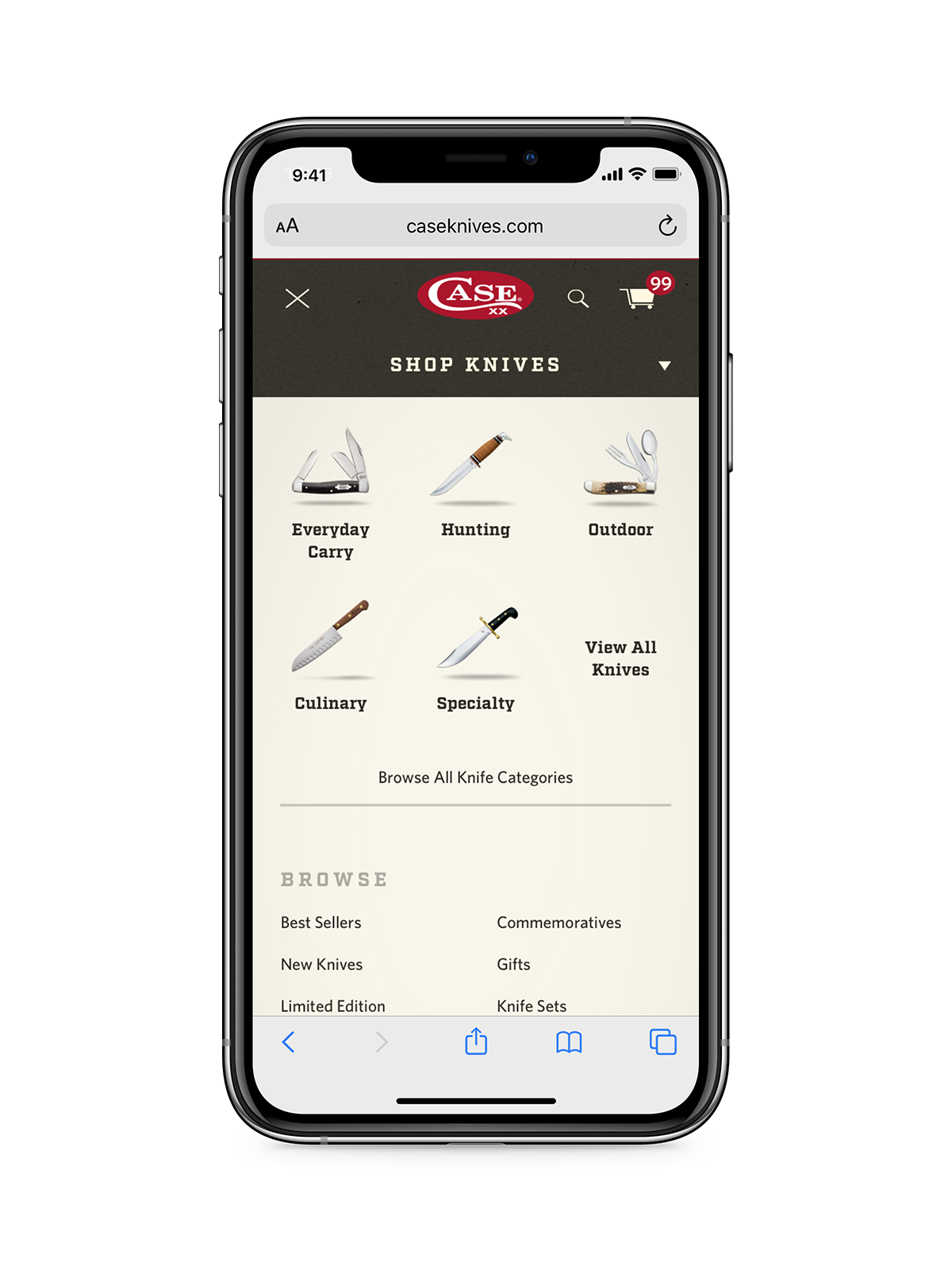
Making Sense of All. The. Knives.

Case has a massive inventory of products; and since they’d never had an e-commerce website before, there wasn’t much groundwork in place.
We worked with our clients to categorize all of their products and content in a logical way, while referring back to the user needs we already identified.
We analyzed the content inventory together with our proposed features and tech requirements to form a site map.
Content Strategy & Wireframes
Now that we’d determined the pages on the site, we moved on to content strategy for each page. What are the business goals and user needs for each page, and what hierarchy should the information have?
We then translated the content hierarchy into a visual layout in the form of wireframes.
A big challenge was solving the Product Detail Page.
Many of Case’s products have extensive options (color, blade, handle, customizations, etc.) with complex interdependencies. We needed to keep the UI intuitive and include educational content to prevent confusion.
We frequently checked in with our in-house Shopify developer about the feasibility of the site functionality we had in mind, since Shopify had certain limitations.
Applying UI Design

I collaborated with the rest of the UX/UI team, as well as brand designers who had already developed a look and feel for the Case brand. Once the client approved one of our high-level design options, we built out a full style guide and collaborative Sketch library and moved forward designing each page in detail.


Development & Launch
Website sales topped $1M in the first year (2018)
Since then, sales have increased 75% year-over-year
Case’s website sales didn’t cannibalize its other revenue streams
The UX team and I worked directly with our developers to bring the website to reality. Sometimes we bumped up against Shopify’s constraints, but worked together to solve these problems. We then performed design and functional QA to work out the bugs before launching the site. The first year after the site went live, the results spoke for themselves.