
I’m Sara Hahn, an Austin-based Product Designer with more than a decade of visual design experience. My work is centered around solving complex UX problems and designing useful, delightful experiences for people.
Currently at H-E-B Digital

COMING SOON
Evolving a motorsport brand’s e-commerce experience
Reach out directly if you’d like a walk-through in the meantime!

Knack Concept
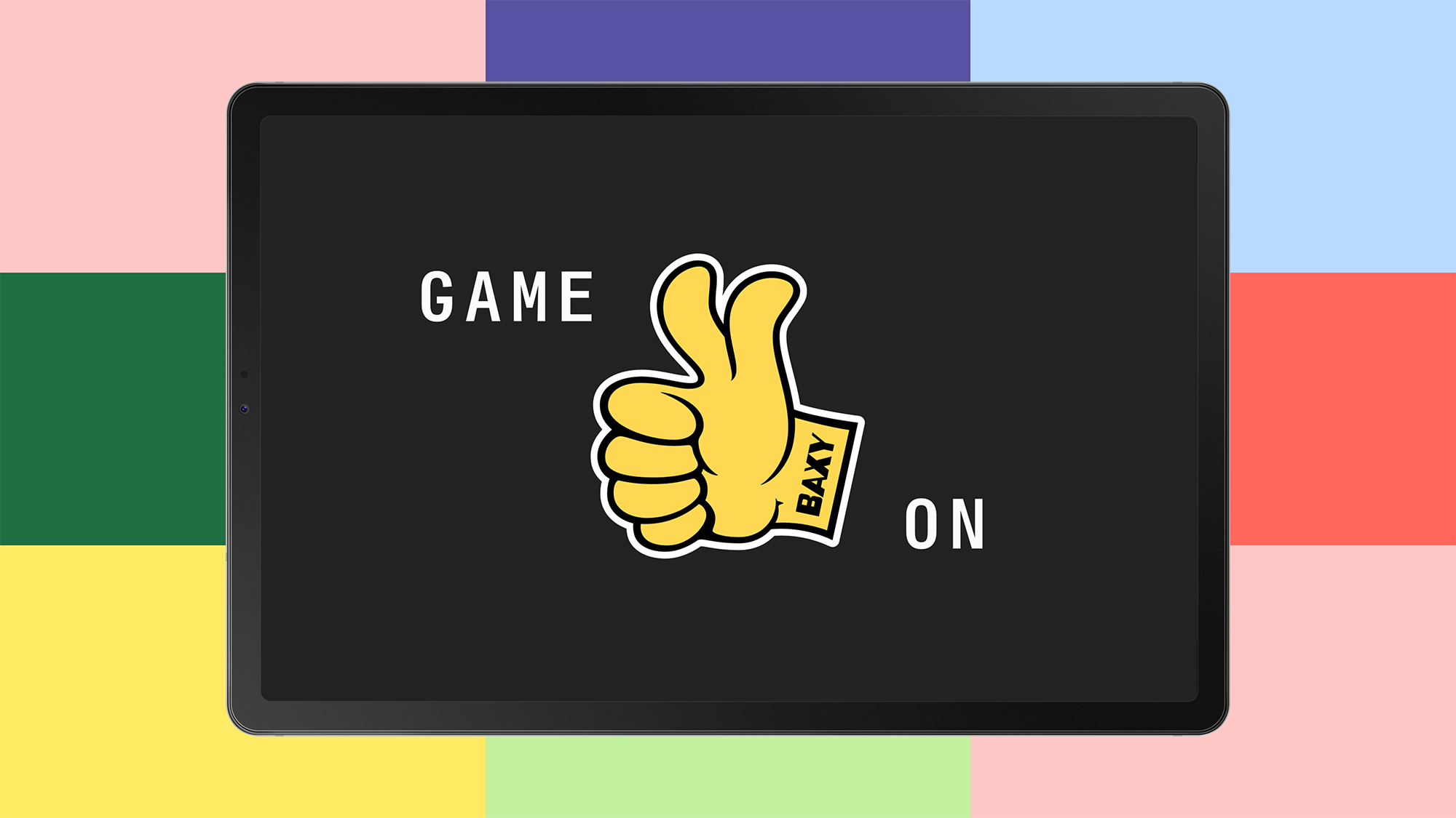
GameStop / BAXY

McGarrah Jessee