Knack Mobile App Concept
Helping adults foster their creative interests
Project Timeframe: 7 weeks
My role: Everything (solo project)
Background
My friends and I had a desire to find a creative respite, like an artistic hobby outside of our jobs and other responsibilities. But there were obstacles preventing us from pursuing this.
Where does one even look for art classes?
Inconsistent class schedules make it difficult to fit into already busy lives.
Supplies and equipment can be pricey for trying something new that may not stick.
People don’t always have space in their homes or easy access to a studio space.
Problem Statement
I suspect that adults with creative interests don’t have an easy, low-risk way to go out and learn new skills.
What if an app could help users exchange artistic skills on a local level?
Research
Before I went about trying to solve this on my own, I needed to see what solutions already existed in the marketplace. I performed a competitive analysis of similar platforms in the arts space, as well as a comparative analysis of indirect competitors outside of the arts category.
User Interviews
With a better understanding of the marketplace, I needed to talk to people in my target audience of artists, makers, and people with creative interests. I created a research plan for my user research goals, as well as a discussion guide of questions to ask in each user interview.
Synthesis
I wrote down notes and observations from these user interviews on sticky notes. I used affinity mapping to find commonalities in my research findings, which I distilled into key themes.
Key Themes
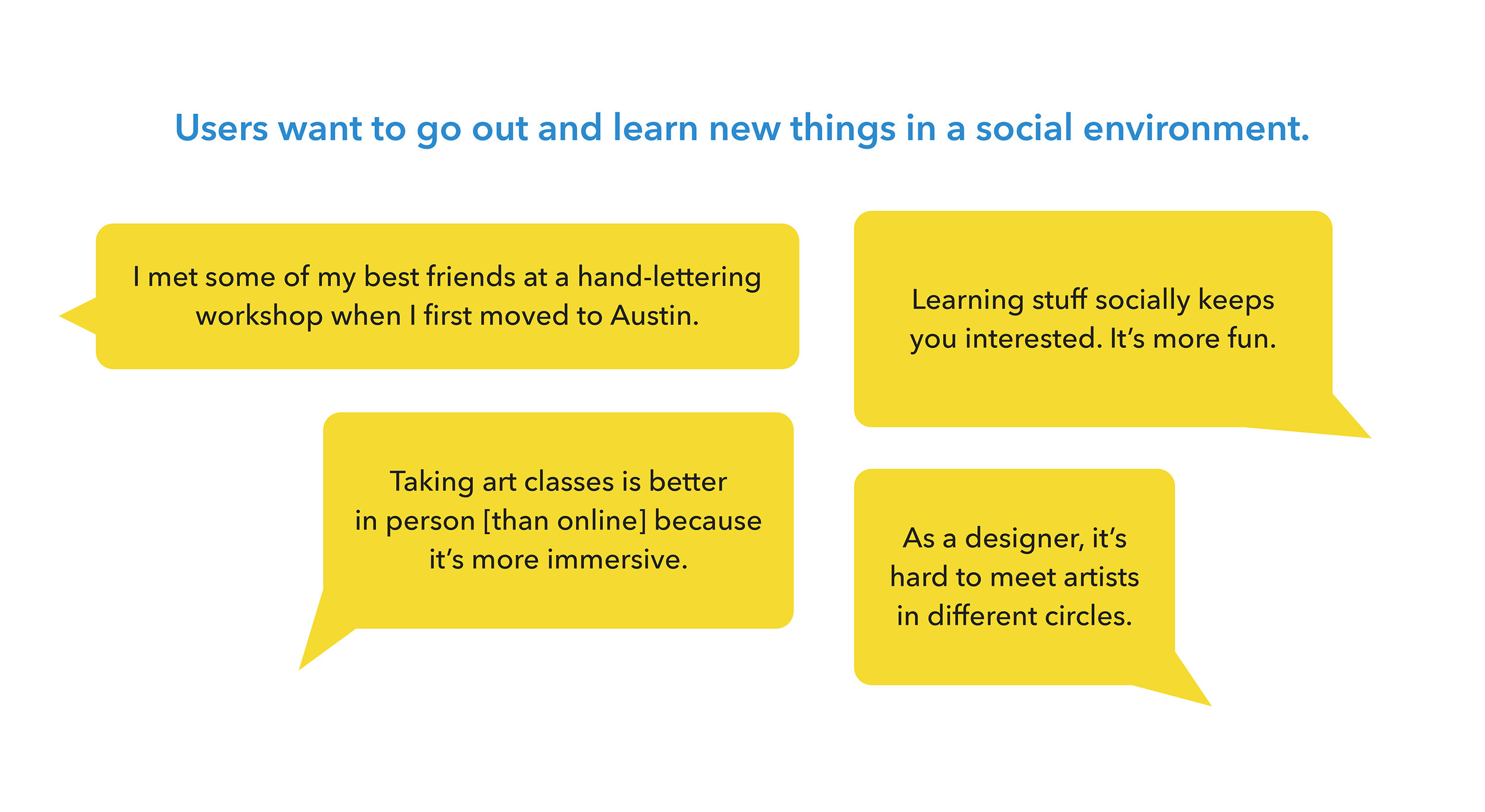
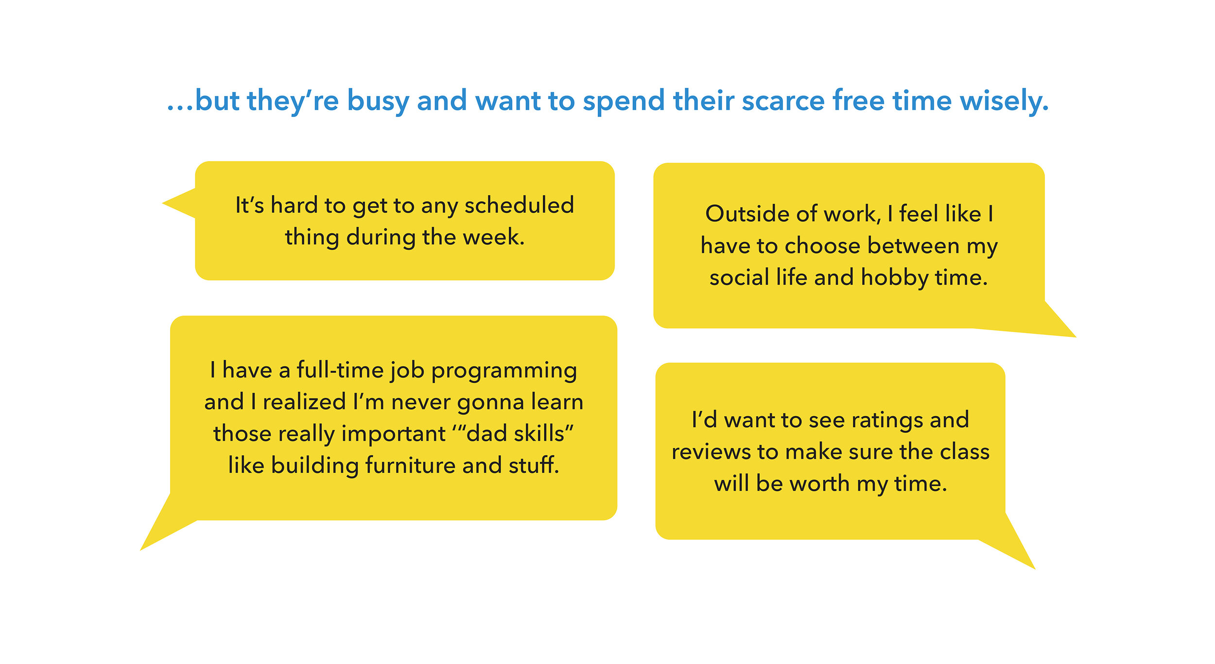
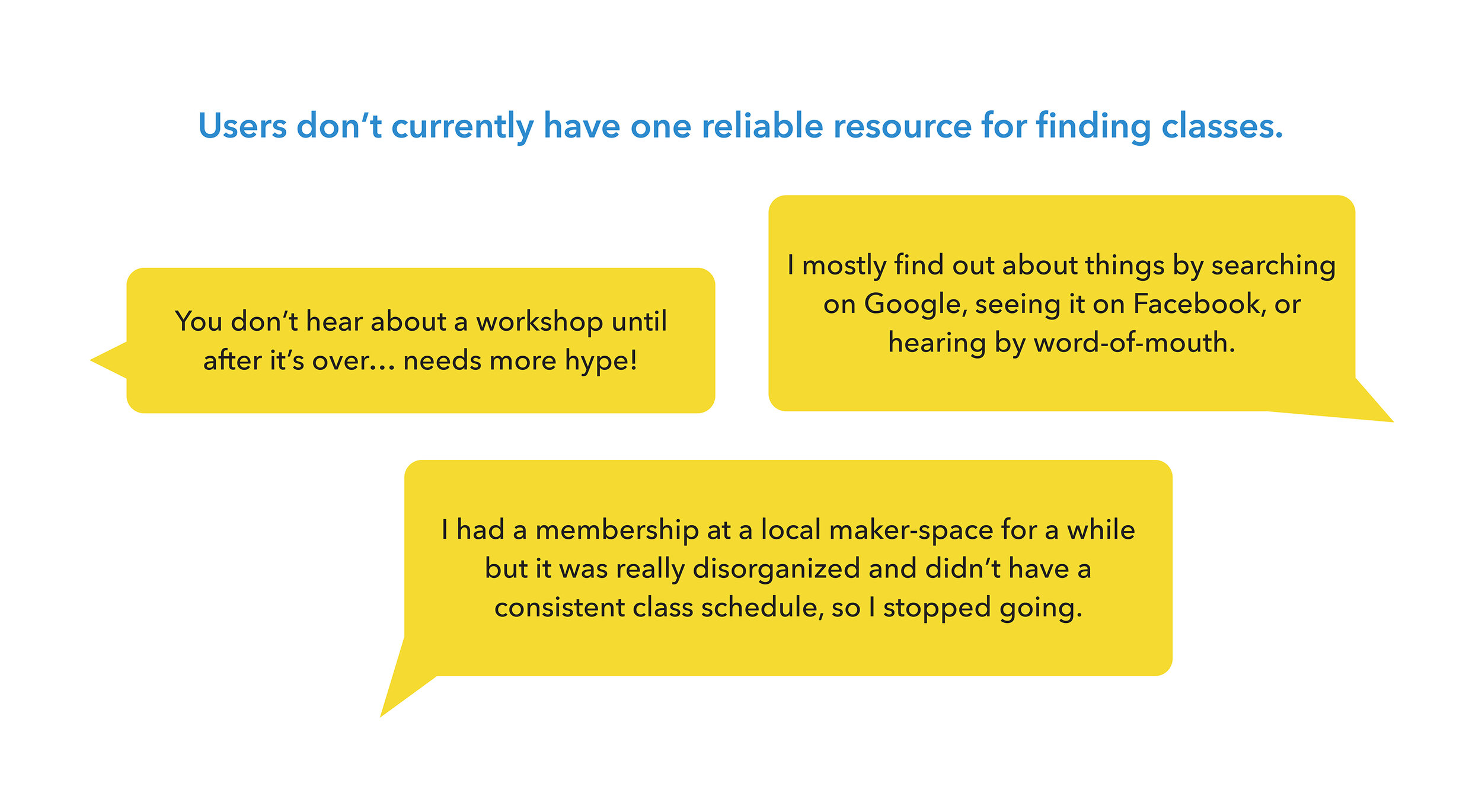
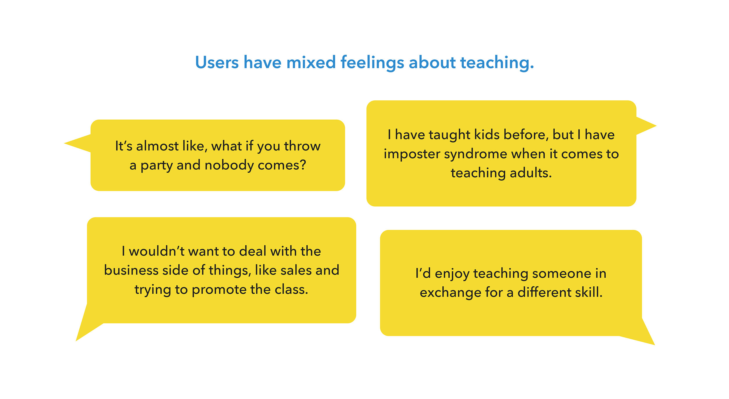
Pivot!
Based on users mixed interest in teaching, it became clear that relying only on user-generated classes was not the best way to move forward. A low inventory of classes would make for a poor experience.
Instead, what if the app was a comprehensive resource for users to find art classes that are already happening in their communities and made it super easy to sign up?
New Problem Statement
Adults with creative interests need a way to easily find art classes that are already happening in their communities, and to be able to seamlessly integrate them into their busy lives.
Defining User Needs
Personas & User Flow
The themes and findings from my user interviews informed two primary personas of potential app users. It’s helpful to refer back to personas throughout a project to maintain empathy for the users and to ensure that every decision is actually answering a user need. The first persona, Elise, prefers to take art classes as a means of social interaction; while the second persona, Matt, is more focused on learning hands-on skills.
With these personas in mind, I mapped out a user flow of steps that users would likely need to follow in order to accomplish the goal of finding and enrolling in a class.
Low-Fidelity Prototype
Based on the user flow, I sketched some screens for a quick round of paper prototyping and user testing.
Putting this rough idea in front of users early on allowed me to see some major holes I needed to work on, like incomplete functionality and missing/confusing navigation.
Information Architecture
Prioritizing Features
I had a better idea of how to proceed after some low-fidelity iterations. But I still needed to clarify the scope of what the app could actually include. I wrote down each potential feature on sticky notes, then sorted them into different priority levels using the MoSCoW method (Must, Should, Could, or Won’t include).
This exercise helped me to define the MVP (minimum viable product) for the app.
Site Map
I began to flesh out the app’s architecture in the form of a site map; but knew I needed to check back in with users to validate my assumptions. I led a card sorting exercise in which I asked users to sort, group and label categories of app content in a way that made the most sense to them.
Observations from this exercise gave me insights into how the app’s content could be better organized, and also how to improve certain terminology.
Build and Test
Wireframes: low- to high-fidelity
The next stage of the project involved the cycle of build > test > revise > repeat in increasing fidelity. I started with updated, low-fidelity sketches based on the newly established site architecture, which I put back in front of users to test some basic tasks.
I took note of needed revisions, then moved into slightly higher fidelity: digital wireframes in a clickable prototype. This time I asked users to complete more specific tasks to really put it to the test.
Observing the users complete these tasks was eye-opening. It became clear that I needed to tweak some language and fix a few navigation holes, among other adjustments I’d need to make to the wires.
Amidst the rounds of testing, I also revised the user flow to better align with how people were using the app and to account for more possible scenarios.
UI Design
With the functionality and structure of the app nailed down for MVP, I could now design the interface — the app logo, color scheme, typeface choices and other UI elements.
I ultimately arrived at the name “Knack” for this app — as in helping people get the knack of a skill they’ve been wanting to learn.
View the clickable prototype
Next Steps
Creating this app within such a limited time was a true lesson in agile methodology. I learned to build, validate and repeat to arrive at a result that answered my project goal. While this app was only a concept, I’d love to someday find a way to build and bring it to life.
After MVP
Continue refining the UI and building out all the screens (beyond limited prototype)
Consider adding features that are on the backlog, such as adding friends within the app
Expand to other creative categories like music, theater, cooking, etc.
Some key things I learned
More interviews and testing produce better results. My assumptions aren’t reliable!
When working iteratively, just keep moving forward. It’s easy to get stuck on details for too long.
